Why Blue?
Look closely at the brands people trust most: banks, technology platforms, professional networks.
Chase. Barclays. Facebook. LinkedIn.
They share a common visual language: blue. Not because it is fashionable, but because it communicates trust, stability, and reliability. In sectors where credibility matters, color becomes a shortcut to confidence.
This dominance of blue is not accidental. It is psychological.
Color Is How Brands Speak Before Words
When business owners ask what color their brand should be, they often expect a stylistic answer. But color choices are rarely about taste. They are about perception.
During my design studies, I became fascinated less by how brands looked and more by why they worked. Why fast-food chains rely on red to create urgency. Why luxury brands favor black. Why hospitals are filled with blues and greens.
Color triggers emotion instantly. It reaches the brain before language does.
A Visual Language We Instinctively Understand
We move through a color-coded world every day:
- Neutral tones in professional settings signal authority.
- Blues and greens in healthcare environments create calm.
- High-visibility colors warn us to pay attention.
These cues work because they are consistent. The brain learns to associate meaning through repetition. Branding operates on the same principle.
Color Psychology Only Works When It Is Consistent
Research shows people form judgments about brands within seconds, and color plays a decisive role in those first impressions. Each color carries emotional weight:
- Blue suggests trust and reliability.
- Red creates urgency and excitement.
- Yellow signals optimism and clarity.
- Green represents growth and balance.
But choosing the right color is only the beginning.
A color cannot build trust if it keeps changing. When shades drift, logos shift, or documents don’t look related, the emotional signal weakens. The brain no longer recognizes a pattern, and meaning starts to dissolve.
In other words: color creates the message, but consistency makes it believable.
The Hidden Cost of Speed: Brand Decay
Modern teams move fast. AI tools, shared templates, and rapid collaboration allow anyone to create content. But speed introduces a subtle risk: inconsistency.
Presentations start to look different. Brand colors vary slightly. Over time, the organization stops looking unified. What was meant to signal trust begins to feel fragmented.
This is not a design problem. It is a systems problem.
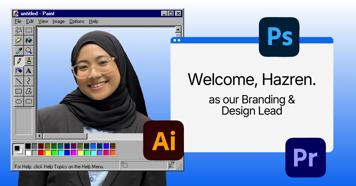
That’s where I come in. I’m Hazren Hazni, the Branding and Design Lead here at Twenty-Four Consulting. In short, my job is to make you remember Twenty-Four through the immaculate, precise, and consistent usage of our visual identity. I ensure that our psychological signal never fades, no matter how fast we move.
Why Twenty-Four Consulting Is Built on Royal Blue
At Twenty-Four Consulting, Royal Blue is not just a brand color—it reflects our role.
In a 24/7 digital environment, clients need reassurance. Royal Blue communicates authority, calm confidence, and dependability. It signals that while we help teams move faster with AI and modern tools, stability remains at the core.
The color sets the psychological tone. The system ensures it never drifts.
Where Canva Becomes a Strategic Tool
This is where Canva, when implemented correctly, becomes essential.
As a Canva Reseller, Twenty-Four Consulting doesn’t simply provide access to design software. We design the structure that protects your brand’s psychology.
That includes:
- Locked brand colors and fonts, so emotional signals stay consistent
- Templates that guide teams, preventing accidental off-brand design
- Scalable design systems, built for speed without chaos
Canva becomes not a creative playground, but a brand safeguard.
Design That Works at the Speed of Teams
The goal is not to turn employees into designers. It is to remove friction.
When brand rules are embedded into everyday tools, consistency becomes effortless. Teams move faster. Content looks professional. Trust accumulates quietly, piece by piece.
This is how design supports growth instead of slowing it down.
The Quiet Power of Getting It Right
Color speaks first. Consistency speaks longest.
When your brand’s visual language is clear and protected by the right systems, people feel confident in you before they fully understand why.
That is the value of aligning psychology with structure—and the role Twenty-Four Consulting plays in helping organizations do exactly that.
If you’d like your brand system to be designed properly—templates, custom icons, and visual assets built for consistency—we’re always happy to talk.

By Hazren Hazni
Branding & Design Lead @ Twenty-Four Consulting
By Hazren Hazni
Branding & Design Lead @ Twenty-Four Consulting

Related Posts