I’m Not a Designer
Just a short introduction—I promise this will be super helpful for anyone who’s not a designer but wants to do great design. My name is Onion, and I’m not a designer.
Coming from a Public Relations & Marketing background, I always imagined my work would revolve around copywriting, advertisements, and marketing plans. While that’s still true, I’ve found myself heavily involved in design work since I started my career. I still remember wondering whether I should tell people I’m a marketer or a designer; it didn’t make sense to me back then.
But think about it: nothing is presentable to a customer without a nice design.
- What’s a great advertisement without a great poster design?
- What’s a great pitch deck without a nice slide design?
- What’s a great YouTube video without a thumbnail design?
If you’re reading this, you’ve probably realised it too—everything needs to be designed, and we don’t always have a designer by our side 24/7.
Does Following Design Principles Really Work?
Short answer: yes. Why? Because I did it the same way.
When I was studying at Taylor’s University, I had a “Visual Communication” class where the lecturer taught design principles. My initial reaction was, “Principles? Doesn’t it just have to look good? Design is subjective, right?”
But after learning, implementing, and practising those principles, I realised my designs suddenly looked better. Fast forward to today, I still follow these principles intuitively.
Although I didn’t start as a designer, I’ve received a lot of compliments on the slides, posters, and websites I’ve built (like twenty-four.io!).
I want to share these five design principles that have impacted a non-designer like me for years. I hope they inspire you too!
Whether you are a teacher designing slides, a marketer creating posters, or just curious about what makes a great design, this blog will be super useful to you!
Stick around to the end for some tips & tricks to make a good design fast!
Enough story, let’s dive straight in!
Disclaimer: If you search “design principles” online, you’ll find many versions. The ones I’m sharing are the five principles that were taught to me and impacted me the most. Feel free to explore other design principles after this!
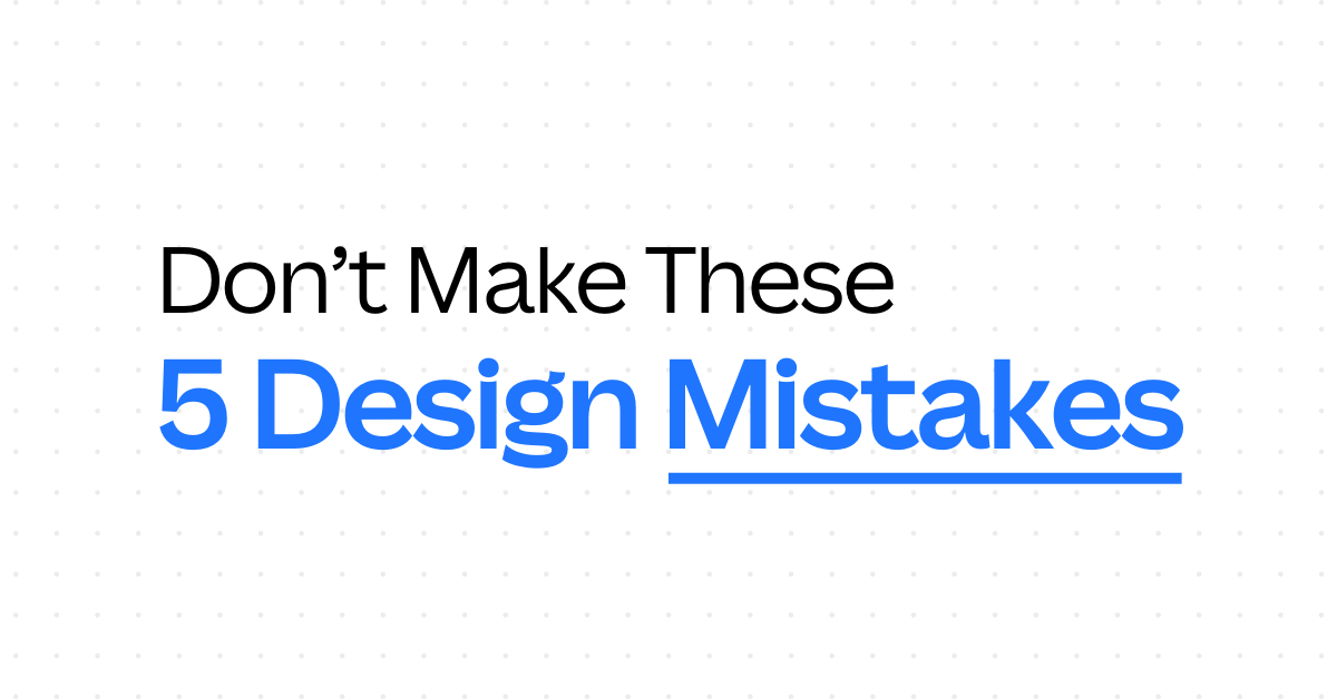
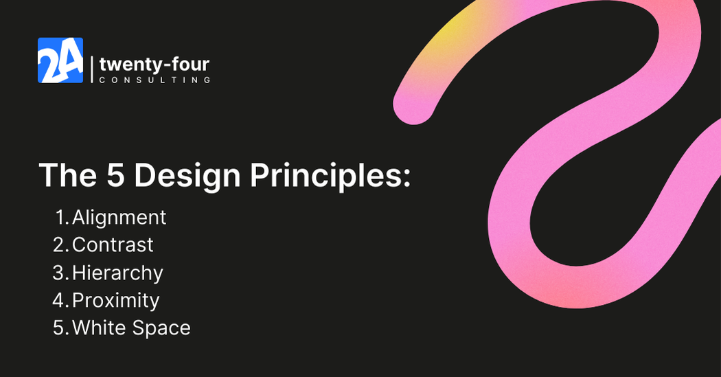
The 5 Design Principles Everyone Should Follow
These are the five design principles I find helpful and think anyone who wants to make better designs should follow. Keep in mind that these are not hard rules but guidelines to improve your design.
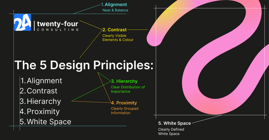
1. Alignment
We use alignment every day without realising it. This blog is aligned left, and you’ve probably aligned text left, right, centre, or justified while writing.
In design, beginners often make the mistake of not aligning elements properly. Here’s an example of bad and good alignment.
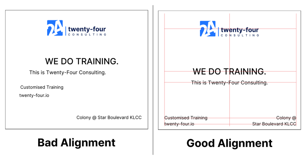
Alignment means lining up text or elements in one straight (invisible) line, making the design look neat and clean. Always ensure your elements and text are aligned.
2. Contrast
Contrast is another principle we live by without noticing. The reason you can read this text is that it’s written in a dark colour on a light background—that’s contrast!
In design, contrast makes elements pop. You’ve probably seen designs where text or elements blend into the background, making them hard to see.
Here’s an example of what I mean.
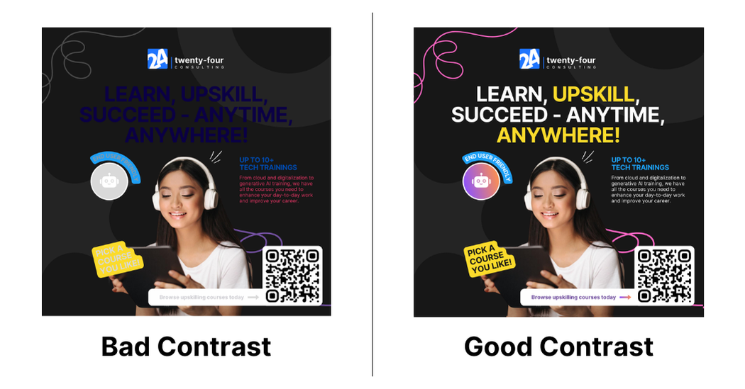
Now that you know the importance of contrast, you’ll never create anything hard to see again!
Remember, contrast isn’t just about colour; size matters too, which brings us to the next principle.
3. Hierarchy
This image is the perfect illustration of what hierarchy is.

Creating hierarchy is crucial in design. It guides the viewer’s eyes to the most important elements first.
Usually, the most important things are bigger, bolder, or more highlighted. A design with a bad hierarchy makes everything feel equally important, confusing the viewer. Here’s an example.
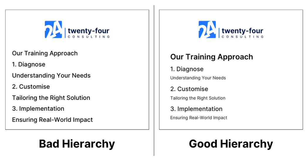
When designing, make sure to guide your viewers to notice the important elements first. Highlight the key points and make the less important elements smaller.
4. Proximity
Proximity may be the trickiest of all design principles; it basically means grouping related things together. Here’s an example.
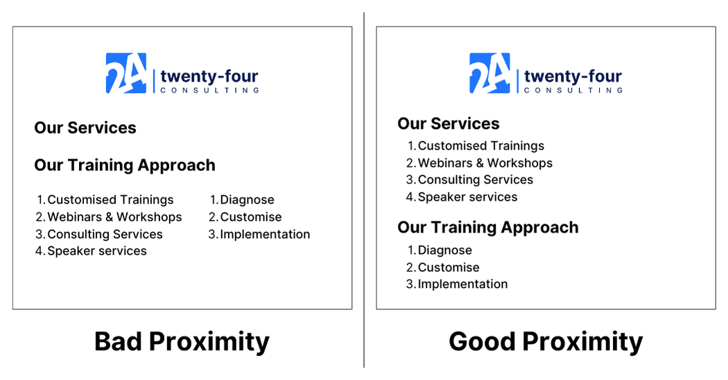
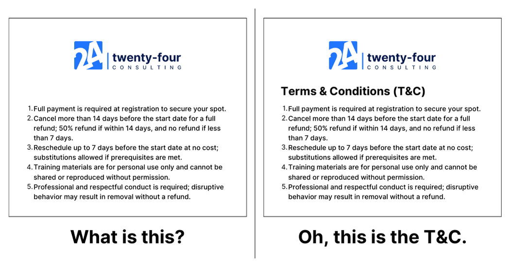
Grouping elements under a title or close together makes the design clearer. For instance, if you see ten lines of text, you wouldn’t know their context without reading. But if they’re under the title “Terms & Conditions,” you know what they are at a glance.
Here’s what I mean.
By grouping related elements, your design becomes much clearer!
5. White Space
I’ve seen many people make the mistake of trying to fill every space in a design, thinking it looks more complete. But white space is crucial.
Look at this image:

You immediately focus on the text in the middle because of the white space around it. White space directs the viewer’s attention to the important parts of the design.
For example, if you have white space on the left, your viewer will naturally focus on the right side.
So, don’t be afraid of using white space or leaving parts of the design empty. Overloading the design with unnecessary elements might distract viewers instead.
But let me clarify this! White space doesn’t have to be white or empty; it’s just a term for areas without much content, allowing viewers to focus on key elements.
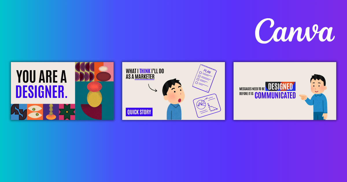
Combination of Design Elements = MAGIC
Now that you’ve been introduced to the five design principles, let’s do an exercise! Look at the image below and find out which principles were used.
Ready for the reveal? Here you go!
Design principles are practised everywhere—it’s amazing, right?
So, my homework for you is to look at some of your favorite brands, examine their designs, and see what principles they use. I can almost guarantee you’ll be amazed at how understanding these simple principles can change the way you see and approach design.
Get creative and practice! Remember, these principles are guidelines, not strict rules. But as a beginner, following them will make design easier and better.
2 Tips to Improve Your Design Process
Understanding design principles is important, but creating a design can still be hard. Here are two tips to help you design better even with little experience.
Find References/Inspiration
It’s nearly impossible for non-designers to create a nice design from scratch because we usually lack direction.
Always start by finding references and inspirations to mimic. Getting inspired is crucial.
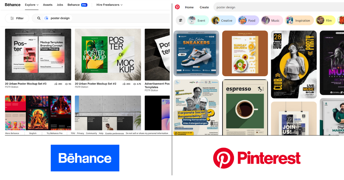
For example, when creating our landing page for Google Apps Script, I looked on Behance for inspiration, found a style I liked, and mimicked it. It turned out great!
Use platforms like Behance, Pinterest, and even Google search for inspiration. Learning from different references gives you a direction to follow.
Note: Mimicking is NOT plagiarism! Learning from references is different from copying someone’s design and slapping your logo on it. Many designers use this method to stay creative!
Use a Design Template!
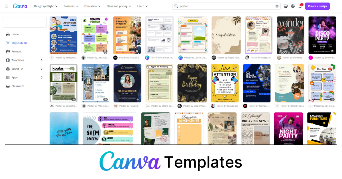
Why not use a template designed by a professional? It saves time!
This is why Canva is popular. It offers many templates for social media posts, posters, slides, and more.
Working with a template allows you to get creative while following principles already implemented in the template. Here’s an example of a poster I made by editing a template!
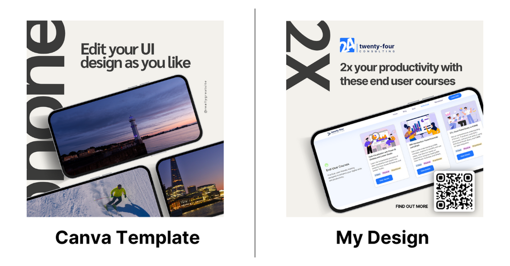
See? It’s much easier than creating a design from scratch. So start using templates, they are life savers!
And That’s It!
If you’ve read this far, I’m super grateful you’re taking advice from a non-designer like me. My intention is nothing but to inspire you the same way I was inspired!
Happy designing!—Onion from Twenty-Four Consulting

By Onion Lim
Content & Social Media Lead @ Twenty-Four Consulting
By Onion Lim
Content & Social Media Lead @ Twenty-Four Consulting

Related Posts