Great presentations don’t just happen—they’re designed.
We’ve all sat through dull slide decks. You know the ones: walls of text, confusing layouts, and visuals that add nothing to the message. If you’ve ever thought, “There must be a better way to present,” you’re not alone.
In this post, I’ll walk you through how to design slides that not only look good—but actually help you communicate better. Whether you’re preparing a report, pitching an idea, or training a team, this guide will help you plan and design slides like a pro.
And yes, we’ll do it all using Canva—one of the most beginner-friendly tools out there.
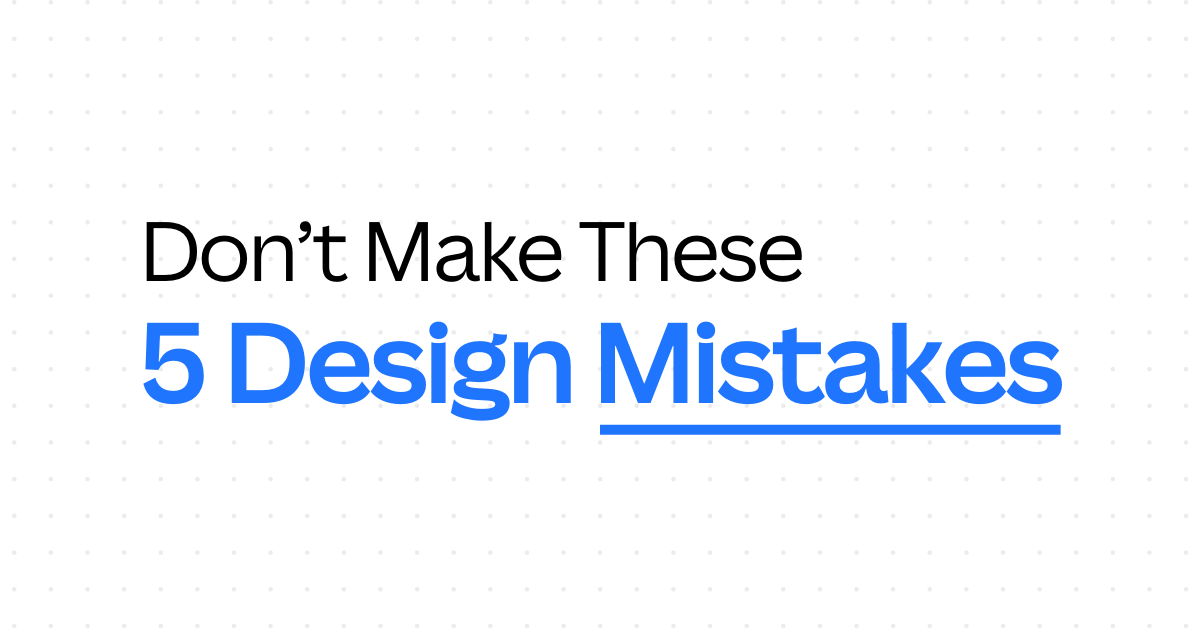
Why Most Presentations Fail
Let’s get straight to the point. Here’s why most slides fall flat:
1. Too much text
Slides aren’t meant to be read like essays. Full paragraphs overwhelm your audience and distract from what you’re saying.
2. No hierarchy
When everything on a slide looks the same, nothing stands out. Viewers don’t know where to focus, which makes your message harder to follow.
3. No visual engagement
Slides with only text feel dry and forgettable. People remember visuals more than they remember words.
The Fix: A Simple Slide Design Formula
If you want better slides, here’s the basic structure:
1. Keep It Simple
Use short bullet points, not long sentences.
If you struggle to shorten your content, try AI tools like ChatGPT or Gemini to summarize your paragraphs.
Example prompt: “Summarize this paragraph into 3 bullet points for a presentation.”
2. Establish Visual Hierarchy
Use consistent font sizes and weights:
- Headings: 35–50pt (bold)
- Subheadings: 30–35pt
- Body text: 25–30pt
This guides your audience’s eyes in the right order.
3. Use Visuals to Reinforce Your Message
Don’t just tell—show.
Add icons, charts, graphs, or high-quality photos to make your content easier to digest. A single image can make your message 10x more memorable.
Plan Before You Design
Designing a beautiful slide means nothing if the content doesn’t flow. So before you touch Canva, ask yourself:
- What’s the goal of this presentation?
- Who is your audience?
- What’s the story you’re telling?
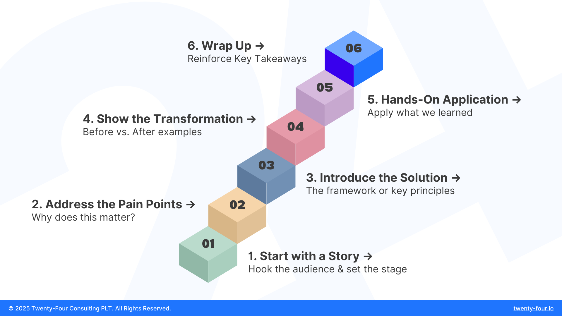
Then, structure your slides like this:
- Start with a story – Hook your audience.
- Address the pain points – Why does this matter?
- Introduce the solution – Your framework or message.
- Show the transformation – Before vs after.
- Apply it – Let them see it in action.
- Wrap up – Reinforce key takeaways.
This isn’t just about design—it’s about presentation strategy.
Canva Makes Slide Design So Much Easier
If you’re new to Canva, here’s what you need to know:
Canva is an online design tool that helps you create professional-looking slides without needing advanced skills. You can drag, drop, edit text, add animations, and even collaborate with your team—all in one place.
With over 225 million monthly active users across 190 countries, and more than 30 billion designs created, Canva has become the go-to platform for people who need to design quickly and effectively.
It comes with:
- Pre-built templates for reports, proposals, webinars, and more
- Access to free & premium fonts, icons, and images
- Easy resizing for different formats (16:9, A4, mobile slides, etc.)
Real-Life Example: Slide Demo from Our Class
During our recent live session, we walked through how to create a training proposal slide deck for a fictional department.
We covered:
- Planning content first using prompts like: “I need help creating a professional slide deck for a training proposal for [department].”
- Finding a suitable Canva template based on the tone (e.g. formal vs casual)
- Adapting the template: adjusting font size, fixing layout, adding branding elements
We even tested both methods:
- Planning content first, then finding a template
- Picking a template first, then adjusting content
Both are valid—but planning first gives you more control.
Want to watch the full demo? Watch the full class on YouTube
Final Tips Before You Start Designing
- Keep your slides focused: one idea per slide.
- If you’re changing too many things in a template, you probably picked the wrong one.
- Don’t overload your slides—your audience came to listen to you, not read paragraphs.
- Use visuals to complement your words, not compete with them.
Work with Us – Canva’s First Agency & Reseller Partner in Malaysia & Southeast Asia 🇲🇾
We’re proud to be the first Canva Agency & Reseller Partner in Malaysia and Southeast Asia—and we don’t just teach Canva. We help organizations implement it the right way.
Here’s how we can support you:
🎓 HRD Claimable Canva Training
- Learn how to design faster, better, and with more confidence through our hands-on sessions.
🏢 Canva Enterprise Onboarding
- We help your team roll out Canva Enterprise—complete with brand kits, templates, and training.
🎨 Design Services
- From poster templates to brand kits, we help you create Canva designs that are clean, consistent, and impactful.
👉 Learn more about our Canva training and services on our our website today!
If you want to stop boring your audience and start communicating with clarity and confidence, slide design is a great place to start.
✨ And if you want to dive deeper, watch the full class on YouTube or check out our Canva courses and learn step-by-step how to build better slides in Canva.

By Onion Lim
Content & Social Media Lead @ Twenty-Four Consulting
By Onion Lim
Content & Social Media Lead @ Twenty-Four Consulting

Related Posts